Brand guidelines · working draft
Quanome.
Your DNA, labs, Apple Health and body data — unified into one private timeline that never leaves your device. This is how Quanome looks, sounds and holds the line.
v0.1 — a starting point. Everything here is up for Ville's comments.01 — Essence
What Quanome is
A privacy-first, on-device health app. We unify genetics, bloodwork, wearables and body data and let an AI coach reason across all of it — and nothing is uploaded. The product is a serious instrument, not a wellness spa. Made by Cultmetrics Oy, Finland. Two markets — Global (EN) and Finland (FI) — same brand, slightly different trust levers (see Voice).
Privacy is the product
"Your data never leaves your device" isn't a feature line — it's the whole posture. Every design choice has to survive it.
Tool, not spa
Yellow-on-black reads as an instrument for people who take their health seriously. Premium, disciplined, lightly irreverent.
Demystifying
We make genetics and lab numbers legible. Smart, plain-spoken, never preachy, never fear-mongering.
The data is the hero
No stock faces. The material itself — base pairs, ranges, timelines — carries the brand. That's also the privacy story.
02 — Logo & mark
The Q mark & wordmark
Two assets. The Q mark — a single custom vector with the inner tail that makes it unmistakably a Q — and the wordmark "Quanome." with its signature yellow period. The mark is the ownable thing; protect it.
The yellow-period rule
"Quanome." always ends in a period, and that period is always Quanome yellow while the letters stay foreground (white on dark, ink on light). It's the smallest, cheapest piece of brand recognition we own — never drop it, never recolour it, never let the whole word go yellow.
Clearspace & minimum size
Keep clear space around the mark equal to the height of the inner tail counter.
Minimum: mark 20px (favicon/avatar), wordmark 90px wide. Below that, use the mark alone.
Don't
03 — Colour
One palette, two modes
Quanome is dark-first but co-equally light. The source of truth is the app's semantic token system (lib/theme.dart) — already built for both modes. Gold is the brand. Sage means "in range / on track," red means "out of range." The neutrals are warm, not cool grey.
Drift to fix: the website tokens (#000 / #0d0d0d / #a8a8a8 / #f5d400) are a cooler, flatter subset of the app's warm system, and use two slightly different yellows (#f5d400 vs hover #ffe21f). Decision needed: align the site to the app's warm neutrals, or keep web cooler on purpose?
Solving the overloaded yellow — three roles, three tokens
Full token set — dark & light
Dark — home
The brand's native environment.
Light — in someone else's house
App Store, press, PDF, print.
Data-state colour
04 — Typography
System sans, set hard
No webfont. We use the platform system stack (San Francisco / Segoe / Roboto) — it's instant, private (no Google Fonts CDN), and renders native on every device the audience uses. The brand comes from how we set it: heavy bold weights, tight negative tracking on headings, generous line-height on body.
Headings
800 weight, −.02 to −.03em tracking.
Body
400 weight, 1.65 line-height, max ~64ch.
Eyebrows
700, +.16em, uppercase, gold or muted.
Numbers
Tabular-nums for every metric & value.
05 — Imagery
Data as texture
The signature spine is abstract black-and-yellow art built from the real material — base pairs, range bars, timeline ribbons, sparklines. No people means no privacy tension and nothing a competitor can knock off. It's generated in code, so it's infinitely producible and effectively free.
Base-pair ribbon — the DNA explorer's signature.
Range bar — sage "in range", gold marker for your value.
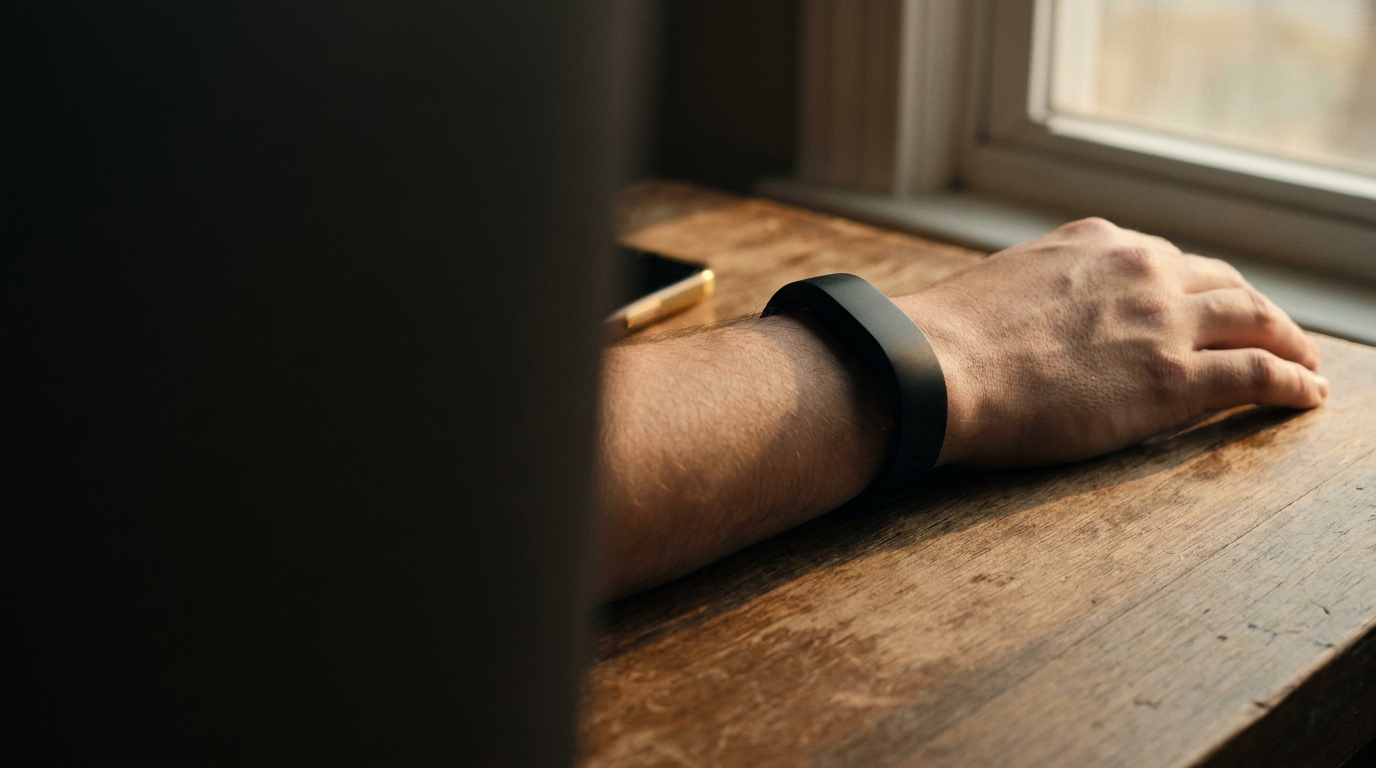
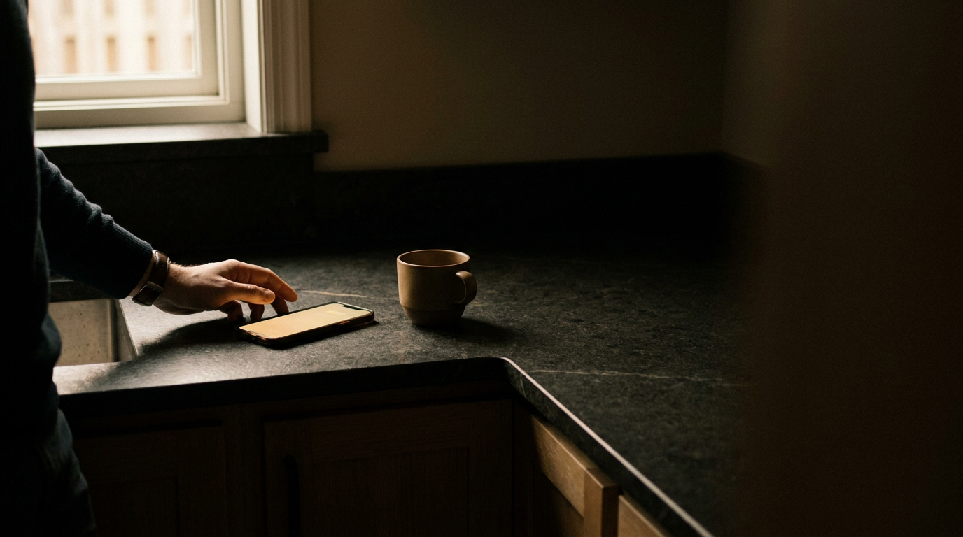
Secondary — a small dose of photography
For paid social and the App Store, a warm, faceless-documentary dose adds human heat. The brand lives in the type overlay — the photo is the mood, the words carry Quanome. Below: first AI-generated drafts (tools/gen_image.py → OpenRouter / Gemini), shown with the live type overlay. Regenerate or swap for real captures any time.

Private by design
Your data never
leaves your device.
Every signal, one place
Your body, on
your terms.
Made in Finland
Tehty Suomessa.
Privacy guardrails — humans appear only as fragments
- Data-as-texture as the default — base pairs, ranges, timelines, sparklines
- A small, art-directed dose of faceless documentary: a hand on the phone, a wrist with a wearable, morning light on a counter
- Real app UI, shot clean on black
- Yellow used sparingly, as the single point of focus
- Faces — ever. Faces next to health data breaks the privacy promise
- Generic wellness stock (yoga at sunrise, smiling in kitchens)
- Cool blue "med-tech" gradients or hexagon-DNA clip art
- Yellow everywhere — it stops meaning anything
Direction in one line: C (data as texture) is the spine; a small dose of faceless-human warmth is the seasoning — reserved for paid social and App Store, never the default.
06 — Voice & tone
How we sound
Smart, demystifying, privacy-first, lightly irreverent. Every piece ties back to one anchor: "your data never leaves your device." We run two markets, not two languages — Global (EN) and Finland (FI) — one altitude, but each pulls a different trust lever.
"Drop your 23andMe file here. No upload. No account. It reads your DNA in the browser — don't trust me? Open the Network tab and watch nothing happen."
Hype, fear-mongering, miracle claims, "unlock your true potential" wellness-speak, or anything that shames the reader. We prove, we don't preach.
Two markets — Global & Finland
Control — prove it
Enemy: corporate data exploitation (23andMe sold your DNA). Lever: you hold the data. Biohacker-adjacent, a little edge. "Your genome never leaves your laptop. Don't trust me? Open the Network tab."
Sovereignty — made here
Same enemy, trust flips: tehty Suomessa, under EU/Finnish law, by a Finnish company. Calmer, institutional trust, less irreverence. "Sinun datasi. Sinun laitteellasi. Ei pilveen."
Asset to build: a discreet "Tehty Suomessa" 🇫🇮 trust mark for the FI App Store listing and site footer — the made-in-Finland angle is a real differentiator, not just a tagline.
The anchor line: if a headline, ad or screen doesn't ladder back to "your data never leaves your device," ask why it exists. That promise is the brand.